- React Native Tutorial
- React Native - Home
- Core Concepts
- React Native - Overview
- React Native - Environment Setup
- React Native - App
- React Native - State
- React Native - Props
- React Native - Styling
- React Native - Flexbox
- React Native - ListView
- React Native - Text Input
- React Native - ScrollView
- React Native - Images
- React Native - HTTP
- React Native - Buttons
- React Native - Animations
- React Native - Debugging
- React Native - Router
- React Native - Running IOS
- React Native - Running Android
- Components and APIs
- React Native - View
- React Native - WebView
- React Native - Modal
- React Native - ActivityIndicator
- React Native - Picker
- React Native - Status Bar
- React Native - Switch
- React Native - Text
- React Native - Alert
- React Native - Geolocation
- React Native - AsyncStorage
- React Native Useful Resources
- React Native - Quick Guide
- React Native - Useful Resources
- React Native - Discussion
- Selected Reading
- UPSC IAS Exams Notes
- Developer's Best Practices
- Questions and Answers
- Effective Resume Writing
- HR Interview Questions
- Computer Glossary
- Who is Who
React Native - Alert
In this chapter, we will understand how to create custom Alert component.
Step 1: App.js
import React from 'react'
import AlertExample from './alert_example.js'

const App = () => {
   return (
      <AlertExample />
   )
}
export default App
Step 2: alert_example.js
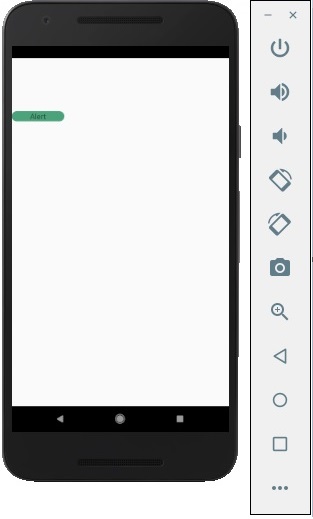
We will create a button for triggering the showAlert function.
import React from 'react'
import { Alert, Text, TouchableOpacity, StyleSheet } from 'react-native'

const AlertExample = () => {
   const showAlert = () =>{
      Alert.alert(
         'You need to...'
      )
   }
   return (
      <TouchableOpacity onPress = {showAlert} style = {styles.button}>
         <Text>Alert</Text>
      </TouchableOpacity>
   )
}
export default AlertExample

const styles = StyleSheet.create ({
   button: {
      backgroundColor: '#4ba37b',
      width: 100,
      borderRadius: 50,
      alignItems: 'center',
      marginTop: 100
   }
})
Output

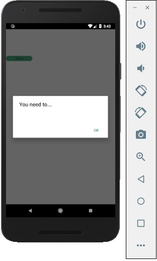
When you click the button, you will see the following −

Advertisements