- Tableau Tutorial
- Tableau - Home
- Tableau - Overview
- Tableau - Environment Setup
- Tableau - Get Started
- Tableau - Navigation
- Tableau - Design Flow
- Tableau - File Types
- Tableau - Data Types
- Tableau - Show Me
- Tableau - Data Terminology
- Tableau Data Sources
- Tableau - Data Sources
- Tableau - Custom Data View
- Tableau - Extracting Data
- Tableau - Fields Operations
- Tableau - Editing Metadata
- Tableau - Data Joining
- Tableau - Data Blending
- Tableau Worksheets
- Tableau - Add Worksheets
- Tableau - Rename Worksheet
- Tableau - Save & Delete Worksheet
- Tableau - Reorder Worksheet
- Tableau - Paged Workbook
- Tableau Calculations
- Tableau - Operators
- Tableau - Functions
- Tableau - Numeric Calculations
- Tableau - String Calculations
- Tableau - Date Calculations
- Tableau - Table Calculations
- Tableau - LOD Expressions
- Tableau Sort & Filters
- Tableau - Basic Sorting
- Tableau - Basic Filters
- Tableau - Quick Filters
- Tableau - Context Filters
- Tableau - Condition Filters
- Tableau - Top Filters
- Tableau - Filter Operations
- Tableau Charts
- Tableau - Bar Chart
- Tableau - Line Chart
- Tableau - Pie Chart
- Tableau - Crosstab
- Tableau - Scatter Plot
- Tableau - Bubble Chart
- Tableau - Bullet Graph
- Tableau - Box Plot
- Tableau - Tree Map
- Tableau - Bump Chart
- Tableau - Gantt Chart
- Tableau - Histogram
- Tableau - Motion Charts
- Tableau - Waterfall Charts
- Tableau Advanced
- Tableau - Dashboard
- Tableau - Formatting
- Tableau - Forecasting
- Tableau - Trend Lines
- Tableau Useful Resources
- Tableau - Question Answers
- Tableau - Quick Guide
- Tableau - Useful Resources
- Tableau - Discussion
- Selected Reading
- UPSC IAS Exams Notes
- Developer's Best Practices
- Questions and Answers
- Effective Resume Writing
- HR Interview Questions
- Computer Glossary
- Who is Who
Tableau - Bubble Chart
Bubble charts display data as a cluster of circles. Each of the values in the dimension field represents a circle whereas the values of measure represent the size of those circles. As the values are not going to be presented in any row or column, you can drag the required fields to different shelves under the marks card.
Simple Bubble Chart
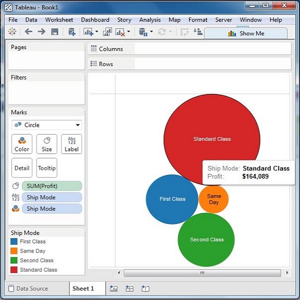
Using the Sample-superstore, let's plan to find the size of profits for different ship mode. To achieve this objective, following are the steps.
Step 1 − Drag and drop the measure profit into the Size shelf under Marks card.
Step 2 − Drag and drop the dimension ship mode into the Labels shelf under Marks card.
Step 3 − Pull the dimension ship mode to the Colors shelf under Marks card.
The following chart appears.

Bubble Chart with Measure Values
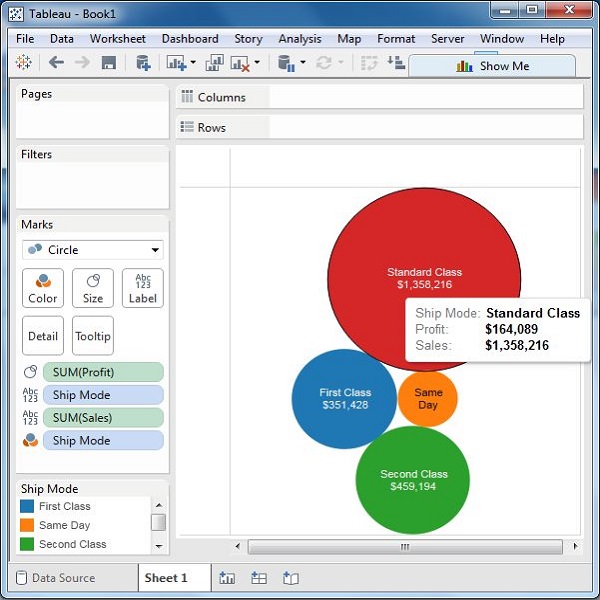
You can also show the values of the measure field which decides the size of the circles. To do this, drag the sales measure into the Labels shelf. The following chart appears.

Bubble Chart with Measure Colors
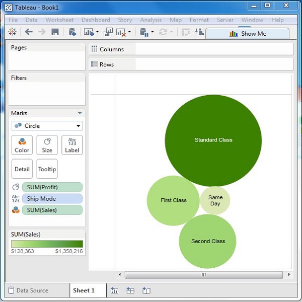
Instead of coloring each circle with a different color, you can use a single color with different shades. For this, drag the measure sales into the color shelf. The higher values represent darker shades while the smaller values represent lighter shades.
