- Tableau Tutorial
- Tableau - Home
- Tableau - Overview
- Tableau - Environment Setup
- Tableau - Get Started
- Tableau - Navigation
- Tableau - Design Flow
- Tableau - File Types
- Tableau - Data Types
- Tableau - Show Me
- Tableau - Data Terminology
- Tableau Data Sources
- Tableau - Data Sources
- Tableau - Custom Data View
- Tableau - Extracting Data
- Tableau - Fields Operations
- Tableau - Editing Metadata
- Tableau - Data Joining
- Tableau - Data Blending
- Tableau Worksheets
- Tableau - Add Worksheets
- Tableau - Rename Worksheet
- Tableau - Save & Delete Worksheet
- Tableau - Reorder Worksheet
- Tableau - Paged Workbook
- Tableau Calculations
- Tableau - Operators
- Tableau - Functions
- Tableau - Numeric Calculations
- Tableau - String Calculations
- Tableau - Date Calculations
- Tableau - Table Calculations
- Tableau - LOD Expressions
- Tableau Sort & Filters
- Tableau - Basic Sorting
- Tableau - Basic Filters
- Tableau - Quick Filters
- Tableau - Context Filters
- Tableau - Condition Filters
- Tableau - Top Filters
- Tableau - Filter Operations
- Tableau Charts
- Tableau - Bar Chart
- Tableau - Line Chart
- Tableau - Pie Chart
- Tableau - Crosstab
- Tableau - Scatter Plot
- Tableau - Bubble Chart
- Tableau - Bullet Graph
- Tableau - Box Plot
- Tableau - Tree Map
- Tableau - Bump Chart
- Tableau - Gantt Chart
- Tableau - Histogram
- Tableau - Motion Charts
- Tableau - Waterfall Charts
- Tableau Advanced
- Tableau - Dashboard
- Tableau - Formatting
- Tableau - Forecasting
- Tableau - Trend Lines
- Tableau Useful Resources
- Tableau - Question Answers
- Tableau - Quick Guide
- Tableau - Useful Resources
- Tableau - Discussion
- Selected Reading
- UPSC IAS Exams Notes
- Developer's Best Practices
- Questions and Answers
- Effective Resume Writing
- HR Interview Questions
- Computer Glossary
- Who is Who
Tableau - Crosstab
A crosstab chart in Tableau is also called a Text table, which shows the data in textual form. The chart is made up of one or more dimensions and one or more measures. This chart can also show various calculations on the values of the measure field such as running total, percentage total, etc.
Simple Crosstab
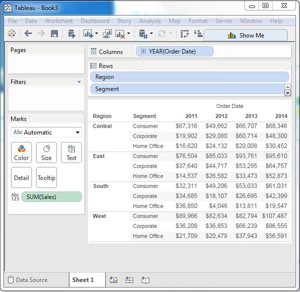
Using the Sample-superstore, let's plan to get the amount of sales for each segment in each region. You need to display this data for each year using the order dates available. To achieve this objective, following are the steps.
Step 1 − Drag and drop the dimension order date to the columns shelf.
Step 2 − Drag and drop the dimensions region and segment to the rows shelf.
Step 3 − Pull the measure Sales to the labels Shelf under Marks.
The following chart appears which shows the Crosstab.

Crosstab - Color Encoded
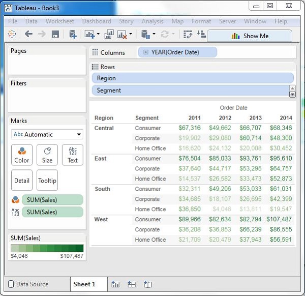
You can get the values color encoded in the crosstab chart by dropping the measure field into the Color shelf as shown in the following screenshot. This color coding shows the strength of the color depending on the value of the measure. The larger values have a darker shade than the lighter values.

Crosstab with Row Percentage
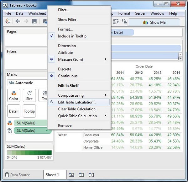
In addition to the color encoding, you can also get calculations applied to the values from the measure. In the following example, we apply the calculation for finding the percentage total of sales in each row instead of only the sales figures. For this, right-click on SUM (Sales) present in the marks card and choose the option Add Table Calculation. Then, choose the percent of total and summarize it as Table (Across).

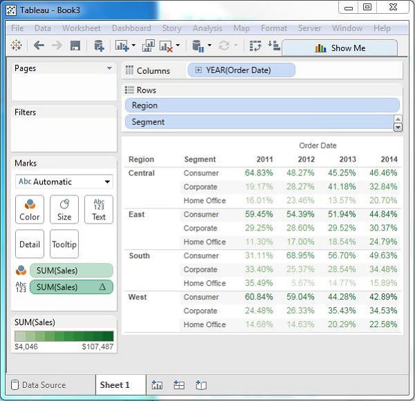
On clicking OK in the screen above, you will find the crosstab chart created with percentage values as shown in the following screenshot.
